Community Favorites

Showing posts with label Stampin' Up!. Show all posts

Saturday, April 16, 2022

He has Risen Indeed!!

Sharing the joy as my family and I celebrate that "HE IS RISEN!"
I love the soft look the Distress Oxide  used as a watercolor on this clear embossed "iron-off" Easter card.  I love the look of iron-off and I use it to make a lot of smooth backgrounds. If you haven't ever tried it, let me warn you... it's addictive!!  It's also easy!  Here's how:
  1. Clear heat emboss your image onto paper.  I have used water color paper, heavy card stock (110lb), and lightweight (85lb) and all have worked well for me, but there are slight variations between regular and watercolor papers.  Today's roses are on light weight cardstock.
  2. Paint your paper with water reactive color.  In this example I used a paint brush to apply watery color with a splooshy effect --- respecting the outlines.  Pre Colored sprays will give you a more random look
  3. Spritz with a little water and let dry (to some of these I added shimmer powder to the water!)
  4. use a heat safe surface, placing the image face up and covering completely with a clean piece of copy paper before ironing over it (on high heat)
All of the clear embossing will be absorbed into the copy paper leaving your original image smooth and flat!  Where the embossing used to be will be white (or the color of your paper) outlines.  It is so pretty because of the way the water color appears to have pooled without line barriers!  

I think the softly pooling colors look excellent with this English Rose design.  I have also found that any image without much detail does not work well as there is too much resist (the embossed areas) and not enough space for color to beautifully pool.  

You may choose to add color in large blocks or blobs directly from the ink pad or spray bottle with equally beautiful results!  If you're using regular paper be sure not to over work it as it will pill with lots of liquid, but the curling can be reduced by anchoring your paper to a flat surface.  The ironing also restores the paper to a nice, smooth flatness!!

If you're using watercolor paper it is a good idea to anchor it to a surface and saturate with color.  Then you can heavily spray it with water and get a lot of movement in the colors - even removing harsh lines from the original inking!
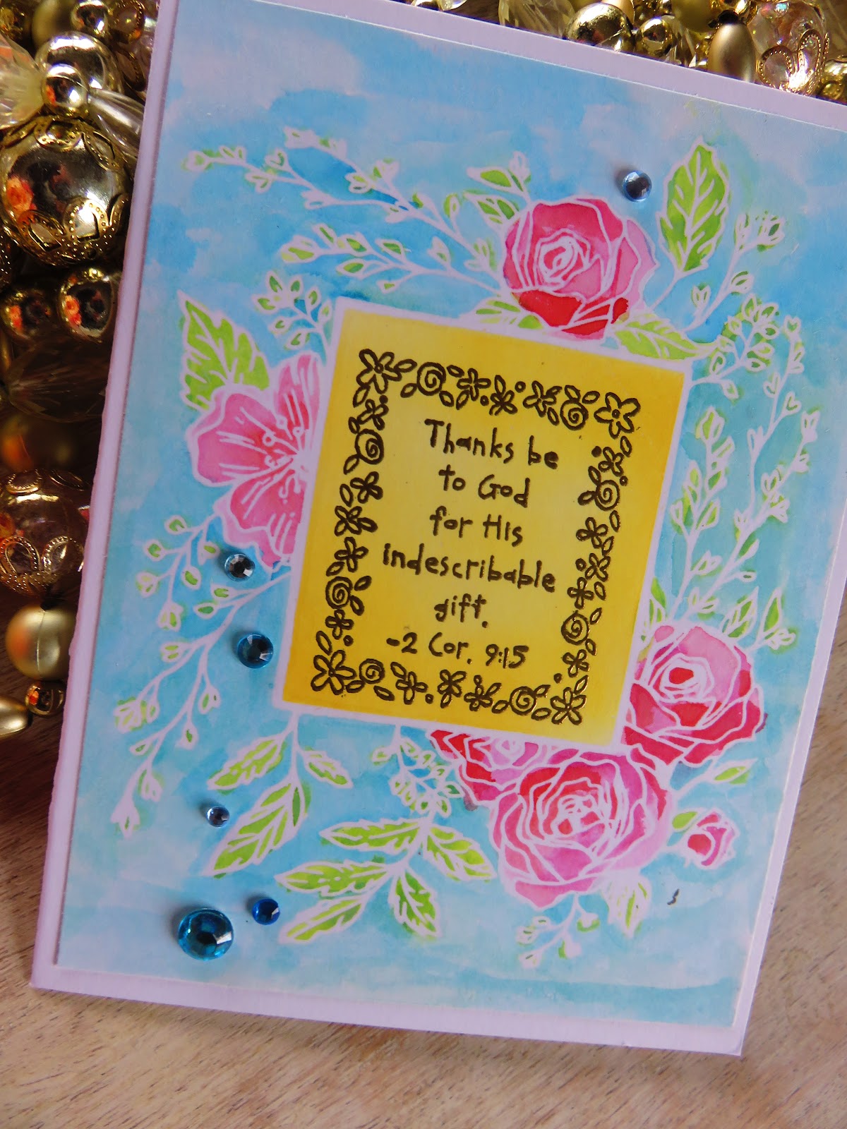

I have found that even my "fails" turn out so pretty!! Oh, here's another hint.  If you like the white lines to be more "blobby" then press your versamarked stamp with MORE pressure. This will spread out the lines as you squish the rubber down to the paper!  If you like a more crisp line then be sure to ink 2 or 3 times - with LESS pressure.  You'll know as soon as you slide the embossing powder across it and can adjust your pressure from there!

Thank You for Stopping by!

#heatembossing #cards #cardmaking #greetingcards #rubberstamping #Spring #papercrafts #paper #papercraftdesign #hinotes #timholtz #Ranger #oxideinks #distressink #ironoffembossing #unitystampco #englishrose

Sunday, November 15, 2020

Expanding Your Inventory of Background Paper

I love background papers, but they can really add up $$ in a hurry and so many times I find the colors to be off just enough that I don't want to combine them.  Here's a little trick I use, I emboss plain papers that have the same color scheme as the original background paper!   

On this card, I used 4 shades of color (green, yellow, purple and taupe) that matched the Stamping up DSP I wanted to use for the base.  To keep it all cohesive I used gold on each of the papers using one of my favorite leaf stamps from #UnityStampCompany.  Then just cut and layer as you like!  This works great with different stamped backgrounds too, as long as the paper colors and embossing powder work with the patterned paper you are using ~ a WIN every time 💗

Of course it doesn't hurt to have a lovely image to stamp, like this one from Unity Stamp Co by Angie Blom!!

#HeatEmbossing #Unity #Autumn #Fall #Cardmaking


Sunday, September 3, 2017

Embossing on Vellum - Peonies

Wow!!  Time flies!! It's time for another inspiration card for the Weekly PIP Challenges! The theme is nearly always anything goes (as it is this week!!) and our generous sponsor is Di's Digis who is offering the lucky winner fun stuff from the Di's Digis Stamp Store!!! 

If you REALLY want inspiration, head over & pick out some things you'd like & then get a card entered in the challenge for your chance to win!!

This card was a lot of experimentation for me.  The image from Unity Stamp's "As We Go Along" which I won in a challenge!!!  (SEE!! You need to enter challenges!!) Embossed in gold on vellum is is layered over homemade sparkle paper (I used 6 inch wide double adhesive tape w/ glitter!) over the top of stamped dots rubbed with subtle stripes of color and then I embossed the leaves OVER THAT!!!

A lot of work but really FUN!! How do you know if you don't experiment once in a while!!!  I thought the whole thing looked stunning on the black/white and pink. The hot pink "hello" was the icing on the cake :)

Of course I dressed up the back!

 
Hope to see your card on the Pammies Inky Pinkies Challenge!! Have a wonderfully blessed week!

Wednesday, July 26, 2017

Sing

Hello Again Fellow Paper Craft Lovers!!  I am really excited to share my latest with you!  The birds are part of the Unity Stamp Co KIT OF THE MONTH from the Always Been You 12/16 set.  I just love them & have lots of plans for them :)  Spring & Summer are just the perfect time to share them!

After water coloring the birds I put a soft gray wash behind them.  I had so much fun layering colors and embossing the various pieces. The little banners are made with washi tape layered on cardstock and the tumble of flowers with tiny gem centers were rubbed with a stylus to give them a 3D effct and glued down in the centers only.  For a full supply list see the end of this post :)


It's always fun to make the back a little special!


SUPPLY LIST:
Embossing Folders: Cricut Cuttlebug “Bit of Paisley” & Sizzix Stampin’ Up! Script
Flower Die: Spellbinders Shapeabilities Cherry Blossoms,
Stamped Sentiment: Unity Stamp Co “Devoted”

Be sure to check out the following blogs & challenges where I have entered this card!

Wednesday, July 5, 2017

Jar Labels


Recently I've decided to start keeping all of my bulk kitchen items in glass jars, Mostly Ball Jars, but I also keep my eyes out for interesting glass jars, I tend to lean towards the tall skinny types.  I just think that they look neat!!!

I decided to make my own labels for the jars after I got 2 similar spices mixed up!!!  Plus it was just plain fun for me to get out my dies and inks ;) My dear friend, who I can attribute my appreciation for all things rustic, saw them and wanted a set for herself.  I made them to match the colors in her 1950's kitchen.  


I thought it would be fun to share what I did with you and I would love to hear if you have ideas or have done something similar and how you did it :)

   I started with 2 die cut shapes that I liked when layered and stamped them with herbal/classic images that I thought went well in a rustic or traditional flavor!  To further the antique look I used tea stain ink from Stampin' Up! and gently rubbed the edges. 


Extra points if you can figure
what spice will go behind this label!
   Once again, after choosing a font to die cut I aged the letters with the tea stain ink.


   It is important to gently bend and curve the labels to conform to the shape of your jars.  If they dry flat after being glued together it is really difficult to make them stick to a glass or plastic jar - they resist the flexing & want to pop off.


Cris sent me photos of how they looked on her awesome jar collection.  I knew you'd want me to share them with you!!


                                         My kitchen is more browns, burgundy and green. After making Cris hers, I'm thinking I like the beautiful brightness of the turquoise and red. . . .hmmm, maybe I'll be blogging a kitchen color overhaul next!


Products used: Tim Holtz Upon a Time letter die, Framelits dies from Apothecary Accents, Stampin' Up! stamps~ Flora & Fauna, Rue Des Fleurs, Notably Ornate

Friday, January 20, 2017

Spending my TIME wisely :)


Something fun :)  Endless possibilities!  I tend to lean toward the fantastic.  I think this would be perfect in a child's bedroom.


The lettering is metal colored with turquoise Sharpie and then covered with copper colored glitter.  I thought this made it look like a patina.  Very little coloring was done to the images stamped in blue, fussy cut and popped up before adhering. The original clock face was removed and photocopied to quality cardstock. 

The bottom stamping is the result of several stamps overlapped with a paper masking technique. This way I could control the curvature of the horizon line & limit the look of repetition ;)


The background stamp, Paisley Background, and Fairyland, images are all from Stampin' Up! 


I like the serene feeling of the subtle coloring and the depth that the pop dot adhesive also gives it. 


A little hard to see, but bright blue and deep blue jewels adorn the outside of the clock's frame, & shimmering glue
dots the floral landscape! The coloring was done with gel pens!


Hope you enjoyed.  Spend your time wisely !! (ha! ha! I'm so clever sometimes!!)
I entered this in the Simon Says "Anything But A Card Stamp Challenge!"  Link up to share your own or just enjoy the other inspirations they have there!
http://www.simonsaysstampblog.com/wednesdaychallenge/

Wednesday, December 7, 2016

Winter Frost Papers

Hello Friends!  Just some fun wintery inspiration for you.  This card is made from the Stampin' Up! Designer Series Paper " Winter Frost ".  I layered bars of my favorites onto black cardstock and laid  that over a pure white card base. 
A  lace border was punched from the front bottom edge only.  I then put a blue ribbon under a sheer ribbon both with banner cut ends.  The sentiment was stamped and embossed on a die cut label whose edges were rubbed with shades of blue ink.  Add 2 gems for accents and "Ta-Da!!" a beautiful, Wintery card!!