Community Favorites

Friday, October 28, 2022

The Witch is IN!

More fun with Angie Blom witch craft ⭐🌜😂

One of my favorite things about cardmaking is all the details.  I am definitely not one of the quickest card makers out there.  I just love to keep adding little tidbits of joy to my projects!!  I also tend to make card fronts and then figure out how to add backs to them without just pasting the front to a blank card base!  


Inside 🕸
 and 
The back of the card🕷


I hope you're having as much fun with this season as I am!!  I can hardly wait to see all the little faces at my door ~ act amazed, a little afraid, filled with laughter ~ as I fill hollow plastic pumpkins with candies!!
#Halloween #Autumn #Witch #Angie Blom

Sunday, September 18, 2022

Making it Clear


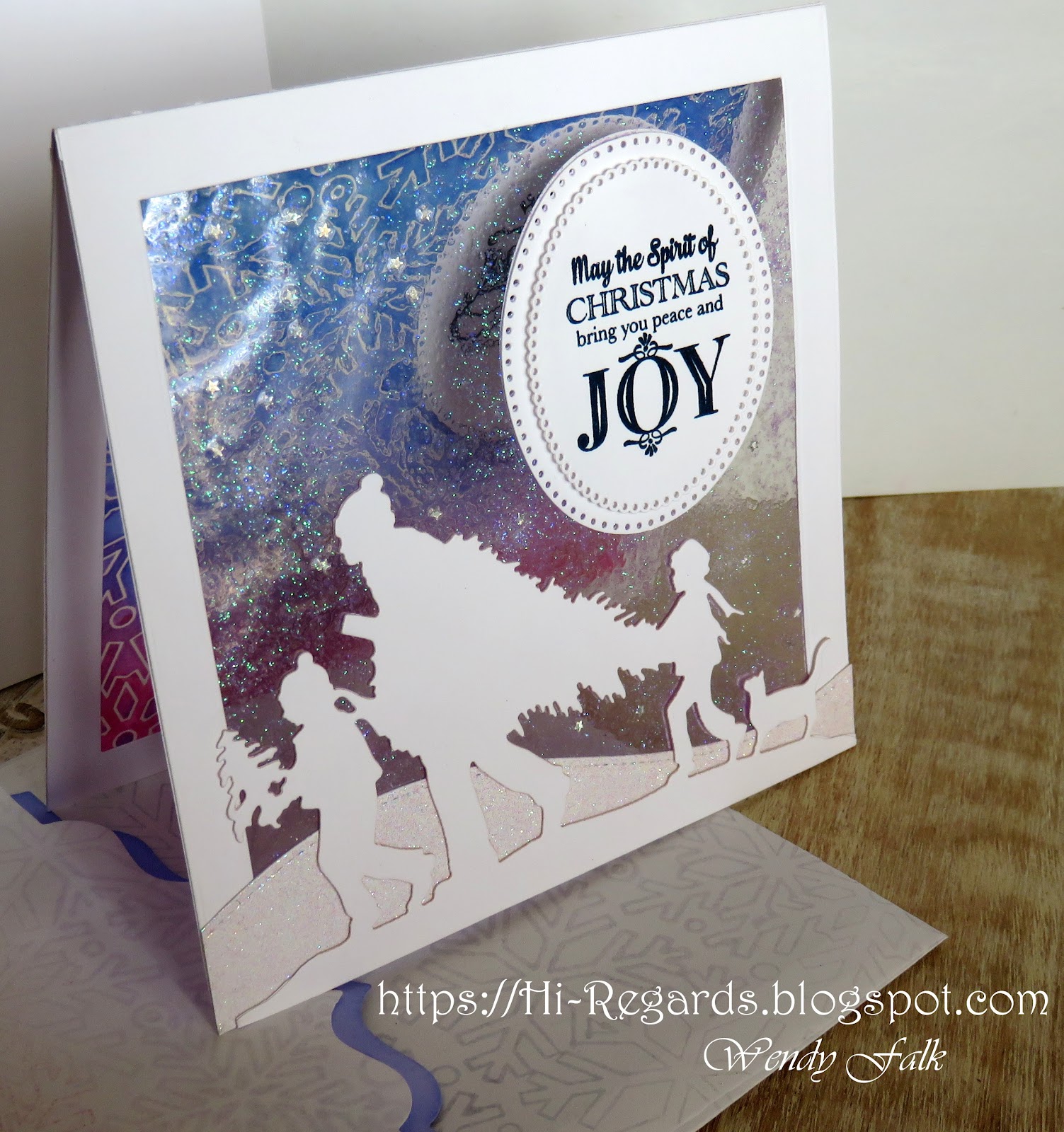
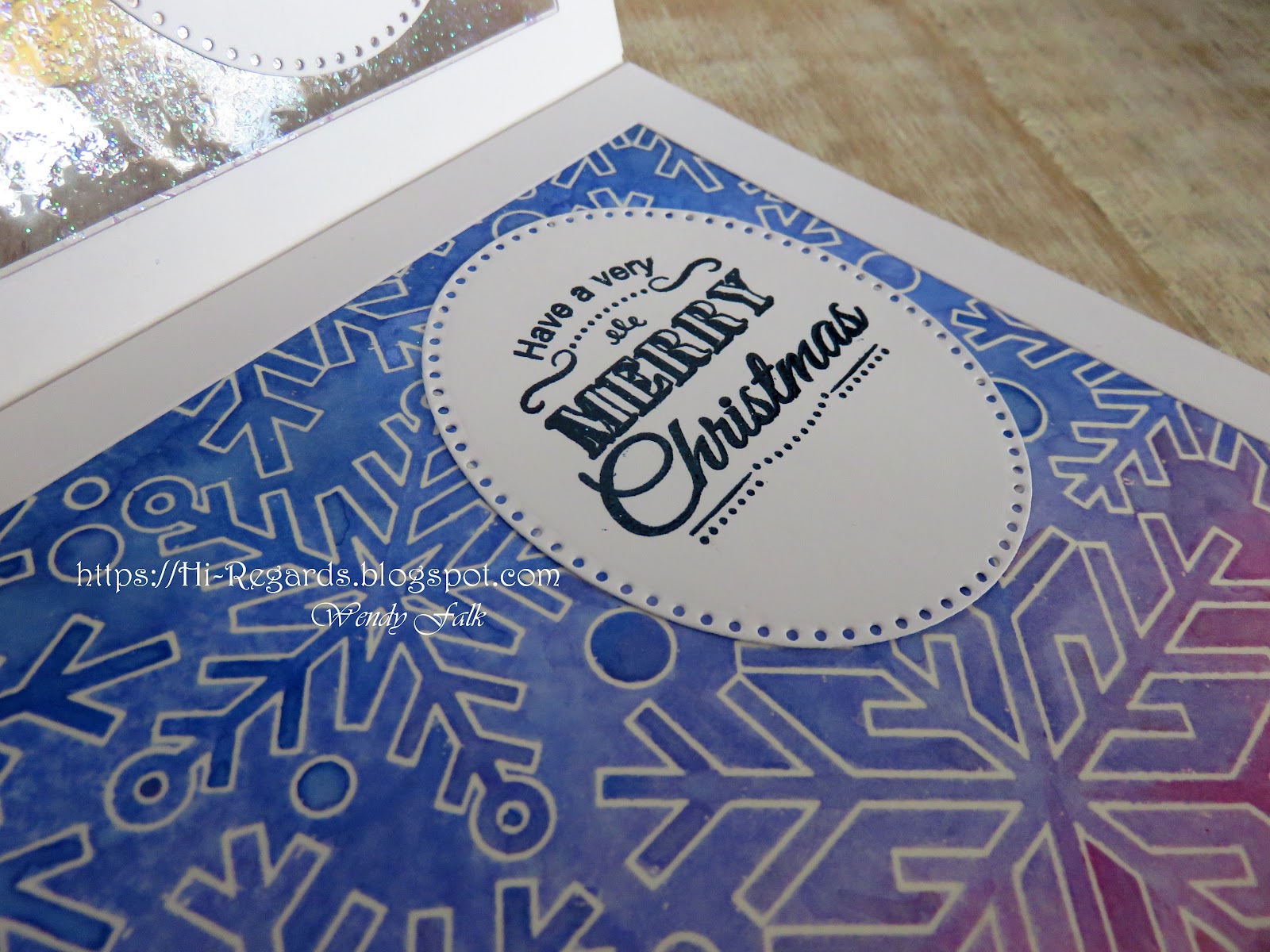
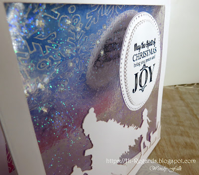
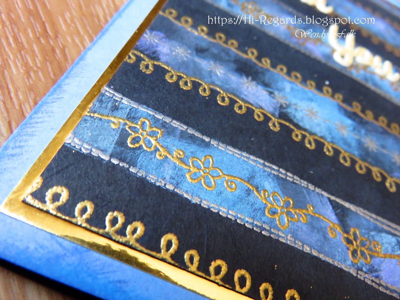
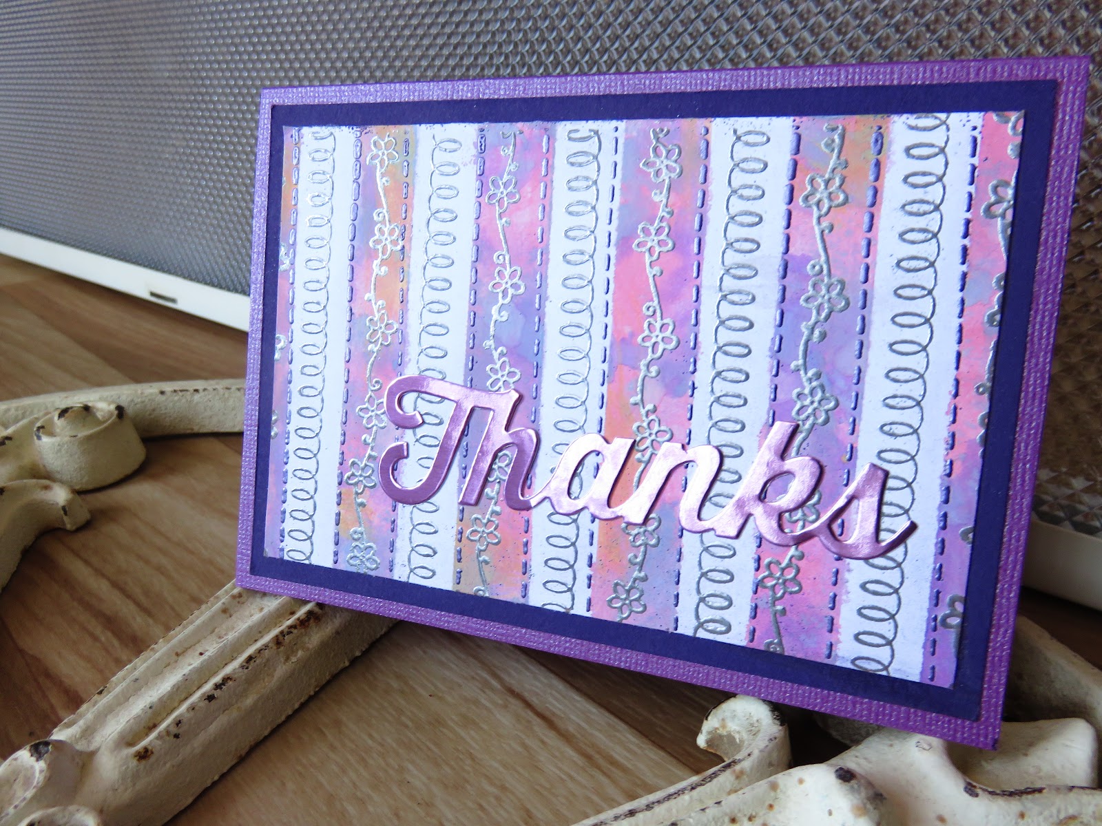
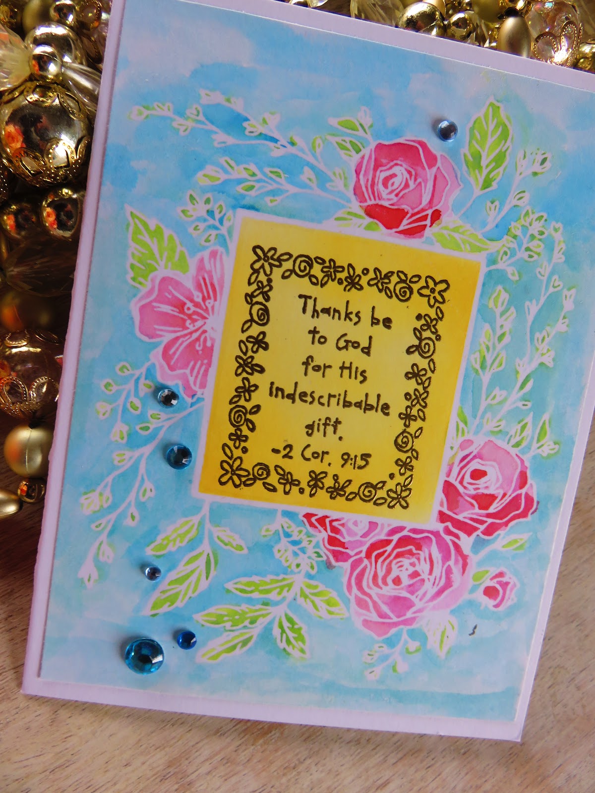
Snow is such a fun theme to work with.  There are so many styles of snow too.  This gorgeous background stamp is from Simon Says Stamp and works great in a variety of ways.  Here is an example of an iron off technique that leaves the paper silky smooth after first clear heat embossing & applying lots of water color.


 Ranger Perfect Pearls in the water adds a beautiful shimmer to your medium.  I used Tim Holtz Distress Oxide Inks in leu of watercolor because I love the soft look of them and the beautiful way they blend.  But you could use any water reactive colorant! Different ones leave different results.

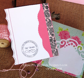
Because the iron off results in a white outline (or whatever color of paper is beneath the clear embossing) the effect is the reverse of using the stamp conventionally, (which would leave an inked outline instead of an inked background).  I love to use my supplies in as many ways as possible, and what a beautiful way!

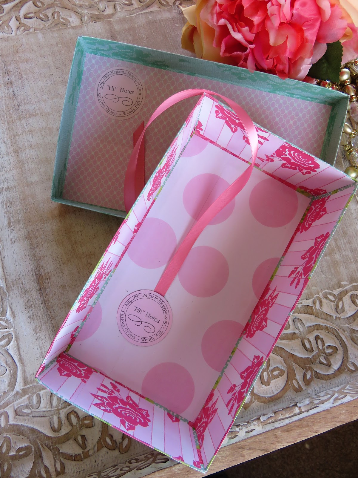
I have also discovered another great benefit to iron-off embossing is the biproduct, sheet of "transfer" paper.  I will quickly describe the process below if you are not familiar with it and link a fun YouTube video I found very helpful!

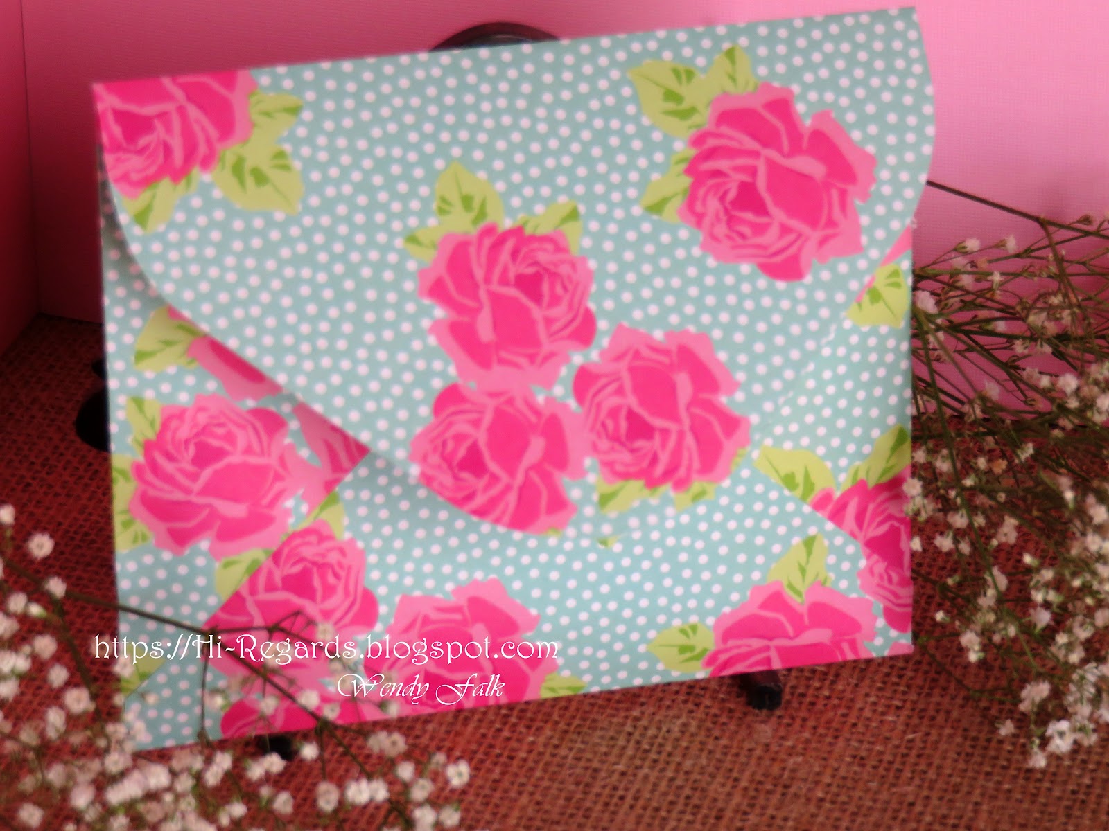
I used ledger size copy paper as my iron off sheet.  Then I used that copy paper to fashion a matching envelope!  To give the envelope a little extra pop I die cut the flap and inserted a piece of lightweight colored paper.  It gives a beautiful impact when the envelope is opened up as well as a wonderfully subtle & cohesive look!

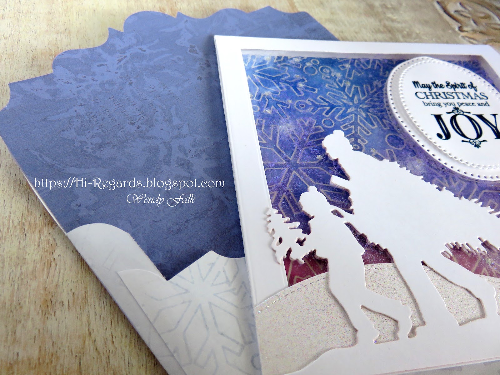
The clear front of the card is the result of glittering the inside of a laminating pouch, laminating and then cutting it to size before "trapping" it in a paper frame.  I LOVE the icy look it leaves!!  I added my silhouette die-cuts and finished the back with the same die-cuts to hide the adhesives!


For a little extra fun I added a hidden sentiment oval inside the card.  The sender can sign the oval on the back of the card flap &/or leave a written message on the back of the card.  

I will be sharing lots of ideas with laminating pouches!  I have found them to be addictive and the unique results are clear!  (ha!! pun intended!!)  Lots of beautiful ways to use them in every season!  Each time I discover something new I can do with them it leads to more experiments and more inspiring ideas!  The price point is great too.  The laminator was only $20 and the sheets I found were about $17 for a box of 200/3ml!! 

Thanks for stopping by!  I really enjoy your comments so please feel free to share your thoughts and ideas below.  Have a great day!!

                                                                                                       
Basic Steps to Iron-Off Embossing:

  1. clear heat emboss your image on heavy cardstock or watercolor paper
  2.  Saturate your image/paper with inks (water reactive colors)
  3. Spray with water (more water to make colors move around a lot, less for a subtle or speckly look - I used lots of water & swirled it around)
  4. After the paper is thoroughly dry use an iron on its hottest setting to remove the embossing. Use a stack layered like this: bottom - thin dish towl (to protect your flat hard surface. I use a glass cutting board), middle - project with image facing up, top - a sheet of copy paper on top of entire image (make sure your iron only ever touches the copy paper on the top of the stack.
  5. Iron slowly without letting the top paper move and all of the embossing powder will wick up and transfer to the copy paper, leaving a faint, nearly clear outline. Once you can see the transfer is occurring you can lift the paper.  If it cools first it will stick to your project so I lift the copy paper right as I lift the iron.  Inspect your original for any shiny spots.  If there are, iron them off with a fresh piece of paper.

iron off video: https://www.youtube.com/watch?v=d3BiE8GyB1c


Friday, June 10, 2022

Happy Wishes

Ever since I was a kid I have loved coloring!  I remember coloring until it got dark out.  In the morning I would be surprised to see the crazy colors I had used thinking they were something different!  And now, great to live in a time when adult coloring books are so popular!  I love rubber stamping because I never run out of images to color!  I have even made "coloring booklets" as crafty gifts.   
 I enjoy coloring just about any image but Angie Blom is one of my favorite artists!  Her images are so full of joy ~ "Sweet 16" is one of my favorites!  

Here I have used water color paints on water color paper.  I love coloring but I'm not great at it!  The medium of watercolor is so easy to use and so forgiving.  Splashing some color around the outside of the image in kind of a halo effect is a favorite technique.  It's beautiful enough to leave the rest of the image uncolored.  Obviously I did not leave these uncolored but instead used Zig  real brush water colors, dropping pools of the darker color where shadows would be.
The decorative edge punched on the back of the card peeks out
when the card is closed, adding interest & spunk!
On the inside I used a balloon stamp that transfers the image silhouette, not the outline.  That way I could overlap the colors an add in the outlines freehand, leaving out the lines for where one balloon disappeared behind another.  

I used intense colors and offset them with black and white washi tape on the front, inside & back.  
Homemade envelopes is one of my favorite things.  They are mostly a necessity for me because I rarely have a conventionally sized card!  Sometimes I use the colorful side of the paper on the inside, sometimes on the outside!  I always make a white label of some sort for the address to go if the envelope is very busy or boldly colored.

Sunday, May 1, 2022

Happy Spring

 Enjoying some Spring colors and crafting even while snow storms and wind howl outside our windows!

I really love this Phyllis Harris stamp from Unity Stamp Co, I have used it a lot!!  It is nice and big so it doesn't take much more than to stamp it and complete a card! And it is filled with childlike J O Y !

This one is embossed and colored with Stampin' Up! markers & watercolor pencils.

The Happy Spring stamp from Stampendous was stamped in shiny gold and colored in in the same way.  A vintage Stampin' Up! flower frame stamp was embossed with VersaMark clear ink and hot pink embossing powder on pale pink paper.
Well, that's it~  I've made several of them with different variations, so if you would like to see more I have been posting them intermittently on Instagram! 


Saturday, April 23, 2022

Lining it Up

 It is no secret that I am in love with linear stamps and stamping!!  I love making my own plaid patterns with these same/similar stamps!  I love the way the masked columns of Distress Oxide Ink make light and dark variations - - similar to how I see light play on water.  And then adding "liquid" lines of heat embossed metallics... simply so addictive!!  It is always rewarding, always breath taking, to see the random & endless play of color and texture. 

This post is mostly just sharing the finished products of my earlier efforts.  If you would like more description here are links to 2 other blog posts & how I accomplished the look 💗 

https://hi-regards.blogspot.com/2018/09/addicted-to-linear-border-stamps.html

https://hi-regards.blogspot.com/2017/08/stripes-fun-with-linear-stamps-and.html

Experimenting with vertical vs. horizontal on blues
Before I trimmed & attached this b-fly I tried it on a couple of color combinations. 
With these beautiful Oxide inks, the colors morph & blend so much they look great
with many combinations

All of the colored embossing powder has a shimmering metallic
finish similar to the silver & gold.  It is from Lindy's Stamp Gang
Well, I always have a reason to give thanks, so I try to keep a large stock of cards saying so in my inventory!  I am thankful for you and glad that you stopped by!

Monday, April 18, 2022

A Day Full of Friendship

Well, it's been nearly a year since my little Georgia married the love of her life and I'm just getting back to crafting & posting some of my projects!  Before I completely move on I thought I would share the shower invites.

What I like most about these Shower invites is the Golden Angel Wings embossing powder from Lindy's Stamp Gang.  It is one of  those rare and unique finishes that shimmers with a translucent glow over various colors creating soooo many variants.  

I wanted to take a quick second to share how beautifully this embossing powder changes depending what it is applied over.

  • The first example is over deep blue (one of her wedding scheme colors)
  • the second (looking purplish) is over deep dark BROWN!
  • the 3rd is over a creamy caramel
I also tried it with clear ink and it was mostly a shimmering clear golden effect and over dark green it stayed mostly dark green!!  

It was so much fun making these.  They were simple with the invite and RSVP info on the back but we were able to customize the colors and I really loved the sentiments. 

Her day - a year later - is still a beautiful memory of joy, laughter and love that we got to share with so many close friends and family.

If you're looking for some portion of the stamps I used on these shower invitations I've kept it easy since most all of the stamps are from Unity Stamp Co.  (again!)  The fluffy dresses, the raining hearts (clipped from the bottom of a cloud), the scalloped frame, the sentiments  💗  


Saturday, April 16, 2022

He has Risen Indeed!!

Sharing the joy as my family and I celebrate that "HE IS RISEN!"
I love the soft look the Distress Oxide  used as a watercolor on this clear embossed "iron-off" Easter card.  I love the look of iron-off and I use it to make a lot of smooth backgrounds. If you haven't ever tried it, let me warn you... it's addictive!!  It's also easy!  Here's how:
  1. Clear heat emboss your image onto paper.  I have used water color paper, heavy card stock (110lb), and lightweight (85lb) and all have worked well for me, but there are slight variations between regular and watercolor papers.  Today's roses are on light weight cardstock.
  2. Paint your paper with water reactive color.  In this example I used a paint brush to apply watery color with a splooshy effect --- respecting the outlines.  Pre Colored sprays will give you a more random look
  3. Spritz with a little water and let dry (to some of these I added shimmer powder to the water!)
  4. use a heat safe surface, placing the image face up and covering completely with a clean piece of copy paper before ironing over it (on high heat)
All of the clear embossing will be absorbed into the copy paper leaving your original image smooth and flat!  Where the embossing used to be will be white (or the color of your paper) outlines.  It is so pretty because of the way the water color appears to have pooled without line barriers!  

I think the softly pooling colors look excellent with this English Rose design.  I have also found that any image without much detail does not work well as there is too much resist (the embossed areas) and not enough space for color to beautifully pool.  

You may choose to add color in large blocks or blobs directly from the ink pad or spray bottle with equally beautiful results!  If you're using regular paper be sure not to over work it as it will pill with lots of liquid, but the curling can be reduced by anchoring your paper to a flat surface.  The ironing also restores the paper to a nice, smooth flatness!!

If you're using watercolor paper it is a good idea to anchor it to a surface and saturate with color.  Then you can heavily spray it with water and get a lot of movement in the colors - even removing harsh lines from the original inking!


I have found that even my "fails" turn out so pretty!! Oh, here's another hint.  If you like the white lines to be more "blobby" then press your versamarked stamp with MORE pressure. This will spread out the lines as you squish the rubber down to the paper!  If you like a more crisp line then be sure to ink 2 or 3 times - with LESS pressure.  You'll know as soon as you slide the embossing powder across it and can adjust your pressure from there!

Thank You for Stopping by!

#heatembossing #cards #cardmaking #greetingcards #rubberstamping #Spring #papercrafts #paper #papercraftdesign #hinotes #timholtz #Ranger #oxideinks #distressink #ironoffembossing #unitystampco #englishrose

Saturday, April 9, 2022

Slim Line Note Card Keeper


I had so much fun making Alana personalized Note Cards I thought it would be good to make her a box to keep them in.  

I love the "slim line" shape so it was really fun to see this box come to life!  I made it about 1/2 an inch larger than the cards so they wouldn't fit too tightly.

A ribbon is anchored on the inside bottom.  It can be pulled to easily lift the cards if they're too nestled for fingers to pry them out!  Alana can use it for future items too, like photos, etc.  

I don't know if there is a name for the method of box building I use, but to get crisp and sturdy sides I like to cut each side piece separately. then line the edges of the box bottom with masking tape and put the sides in place on the exposed tape.  It's super fast and simple to then fold up the sides into the box shape and fortify the outside with a few strips of tape.

Before adding decorative paper I like to decide if I want the corner fortifiers to be on top of the papers as decoration or under, and invisible.  If they won't show then they go in first and if they are to be decoration then I add them last.  I follow the same plan for the box top making it about 1/16th inch larger than the top.  

For this box I hid all the corner reinforcements except for the outside only on the box top. I used a die cut scroll to accent as it reinforced! 
Another fun idea is to add "feet" to the box.  Sometimes I use large beads or the actual "feet hardware" you can buy for making miniature furniture!  This time I just used half round glass 'blobs' for a low profile look!


It really makes a difference in the feel of the finished project and the sound it makes when it's set down is very satisfying!  Try it, you'll see!!!!

I will share a better tutorial concerning the construction of boxes.  They are fun and easy & lovely when you just want to try using die shapes & embellishments in new ways.  Therapeutic really!